News

new paper

I ordered some large paper from Blick recently, which showed up a couple days ago. I’ve been waiting to open it until I had some time to size the paper and get to work on it. I haven’t drawn on such large paper in a long time (22×30″) – it’s 140lb Fabriano watercolor paper. I felt like a kid at Christmas opening up the flat box. After soaking, stretching and drying the paper I laid down some initial watercolor washes. Now I’m just waiting for the surface to dry more thoroughly.

If I remember I’ll try to post some progress images as I work on them.

Desert X reflections

Last Sunday Sarah and I embarked on a spontaneous trip out to Desert X, a showcase of contemporary art out in the Southern California desert.

There is a lot to see and we started late, so we had to be pretty selective. First stop was to Doug Aitken’s Mirage; a ranch-style mirrored structure. It reflects the desert floor, the sky, clouds, rocks – becoming almost invisible.

After that we headed to the Ace Hotel to pick up a map and check out the Desert X Hub.

imag1622

After a couple cocktails poolside it was time to see more.
MAPS
The Map from the Desert X Hub comes in the back of a full color publication about Desert X, complete with articles and advertising. Directions are also available on an interactive map: https://www.desertxtour.com/map/ but some of the directions were not specific, i.e. getting directions from the interactive map lead us to the intersection of Frank Sinatra Drive & Portola Ave…which is a busy intersection. After a couple u-turns we saw the Desert X sign north of the intersection on Portola. It seems there’s a more accurate Google Maps map, which I didn’t know about on Sunday. Apparently if you click on the words INTERACTIVE MAP LINK – CLICK HERE it’s different than if you click on the image of a map, which takes you to the more accurate Google Map? Here?

Phillip K. Smith III’s The Circle of Land and Sky; a circle of 300 angled reflecting posts:

By this point in the day the constant navigation and photography had almost completely drained my phone battery. (Be sure to charge your devices and bring plugs, chargers, batteries, etc.)

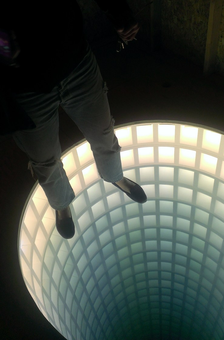
Glenn Kaino’s Hollow Earth was a fun illusion of depth in a small shed-like structure that seems to go down infinitely. There seems to be an almost instinctual moment of terror when first noticing it.

imag1646

We arrived at Lita Albuquerque’s hEARTH two minutes too late. It was Sunday and the Sunnylands Center & Gardens (where hEarth was) closed at 3:45pm – it may be open different hours on different days.

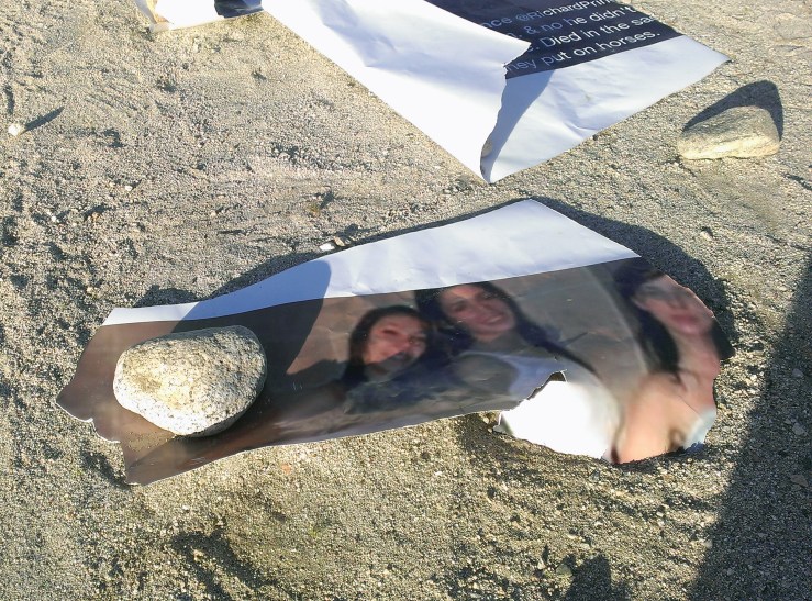
On our way out of the desert we made a last stop at Richard Prince’s Third Place; a beat up house in Desert Hot Springs. “Family Tweets” are plaster on walls, scattered around, held on the ground by rocks. Paint, dilapidation,sculpture, dirt, rusted objects. When we were there the wind was really howling which made it a bit more surreal.

imag1654

We headed home after that, knowing we only saw a small portion and wondering when we could get back out to see more. Take your time. I would recommend either staying out there a couple days/nights or arriving as the sun comes up (which we didn’t do).

Here are a couple articles about Desert X:

Massive Desert X art exhibit debuts in Palm Springs area

That Mirage at Coachella Isn’t Beyoncé, It’s Desert X

At Desert X, 16 Artists Make 45 Miles of the Coachella Valley Their Canvas

If you’ve been out to Desert X, what did you like or not like about it? Let me know in the comments


art cards & business

I read somewhere that an artist should invest approximately 10% of their income (if not more) on their art: supplies, marketing, etc. In the past couple months I’ve been adhering to this idea.

I recently purchased new art business cards through MOO cards. Semi-gloss, quality paper, I really like them and they didn’t cost as much as I thought they would. You can add up to 50 different designs, I opted for four. If you’re interested in purchasing cards use this referral link and get $15 off your first order: MOO cards

I also bought another Copic Multiliner set of pens (.03, .01, .003, .005) – they’re pigment based, waterproof, archival and acid free. They’ve become my go to pens for stippling and seem to last a long time. I believe it’s been over a year since I last ordered a set.

Lately I’ve been using a cheap mechanical pencil (plastic body, unknown lead type) that I found somewhere. It’s yellow and green, rather ugly – but I really like the line values and the lack of sharpening all the time. My next purchase (hopefully Saturday) will be a quality metal-bodied mechanical pencil, I can’t wait. (Little things bring me joy)

Work on display & for sale:
I now have about 13 pieces displayed at Community Brains in Pomona, CA.; work ranging from small mixed media on paper to larger paintings on canvas. All of them are for sale at very reasonable prices. It was nice to get some of the older paintings back out into the world and forced me to re-evaluate my art storage area, which everyone should do once in awhile.

And to wrap things up, here’s a recent small drawing. Watercolor, graphite, ink and colored pencil on watercolor paper. You can find more of my recent work on my Instagram account instagram.com/johnotterart/johnotterfeb2017001

Imperfection is beauty

Imperfection is beauty, madness is genius and it’s better to be absolutely ridiculous than absolutely boring.

~ Marilyn Monroe

I’ve been thinking about controlled chaos lately, or some form of struggle to control and embrace imperfection. Repeating patterns with slight variations. In my art I strive for perfection, knowing it’s unattainable. I must have certain tolerances, ranges of acceptability – if I go outside those I’m free to change course.

The other day at the start of a new drawing I thought I was a bit heavy handed with some watercolor, to lighten it up and bring it back I gessoed over it. I don’t think I have ever done that before. I’ve gessoed over paint on canvas but never over watercolor. It was quite liberating and I like the new surface.

In art school I was taught to embrace “happy accidents,” but accidents still frustrate me, even if barely perceptible. When I place a dot and it’s out of line I cringe ever so slightly on the inside. If it’s too far out of line I might consider changing directions, but usually I’ll let it slide. Stepping back, maybe blurring the eyes a bit, a tiny dot that’s slightly out of line doesn’t seem too bad.